Helping Explain How PBMs Work

The Opportunity
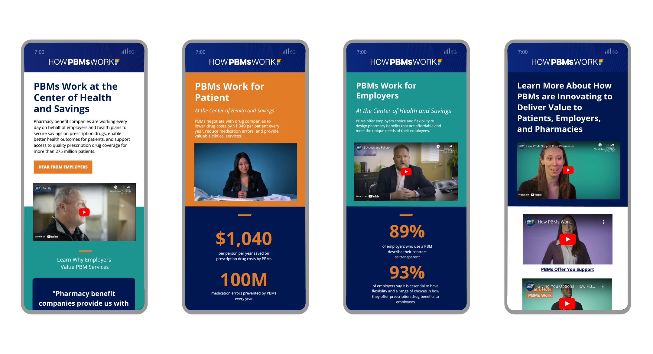
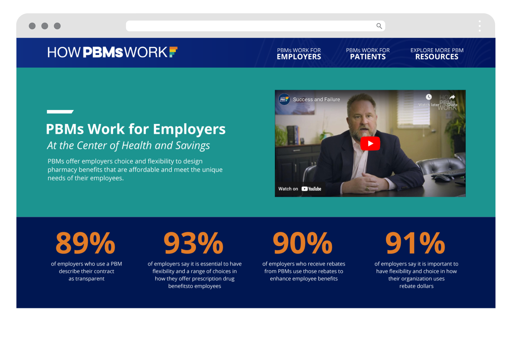
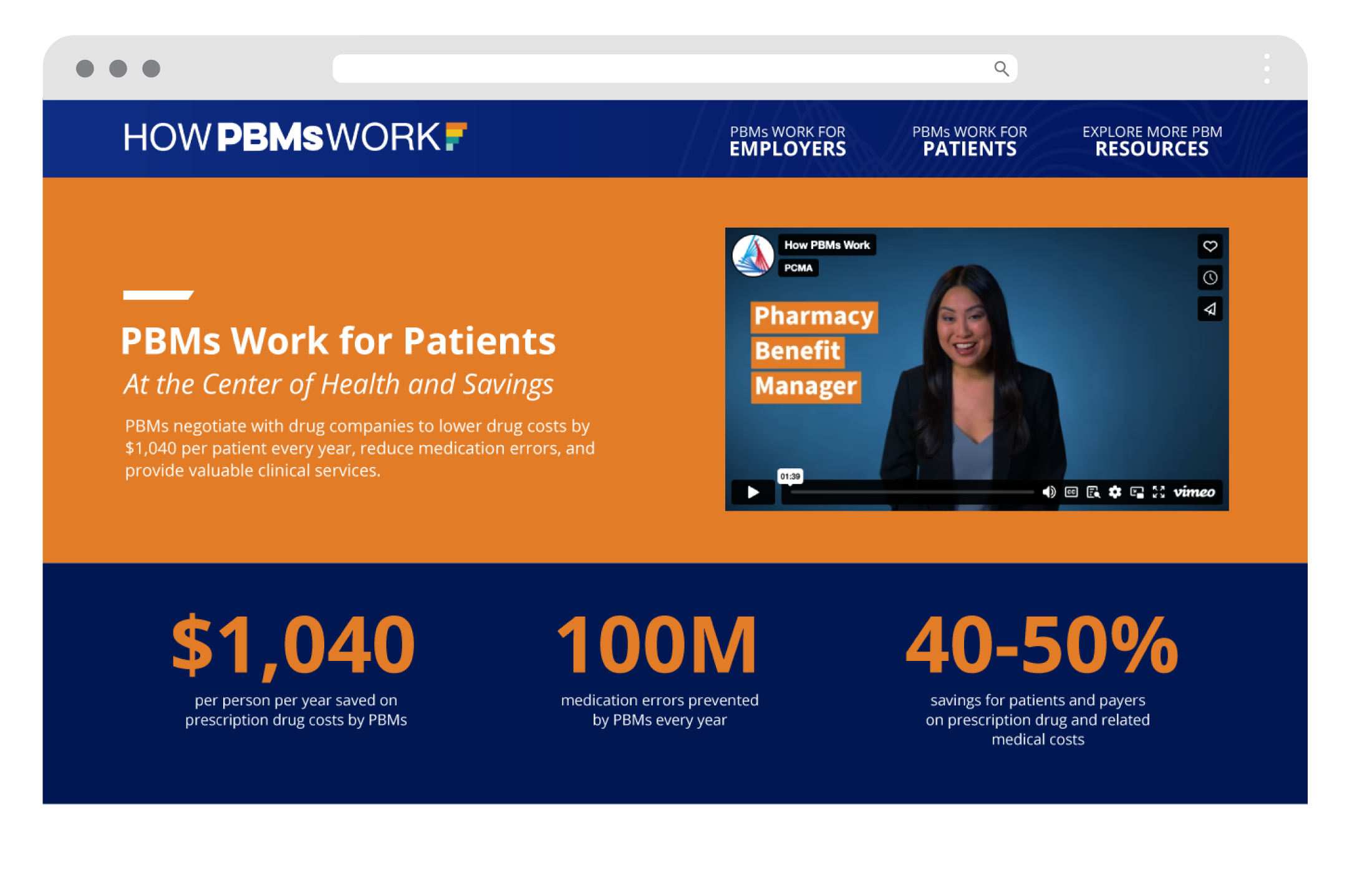
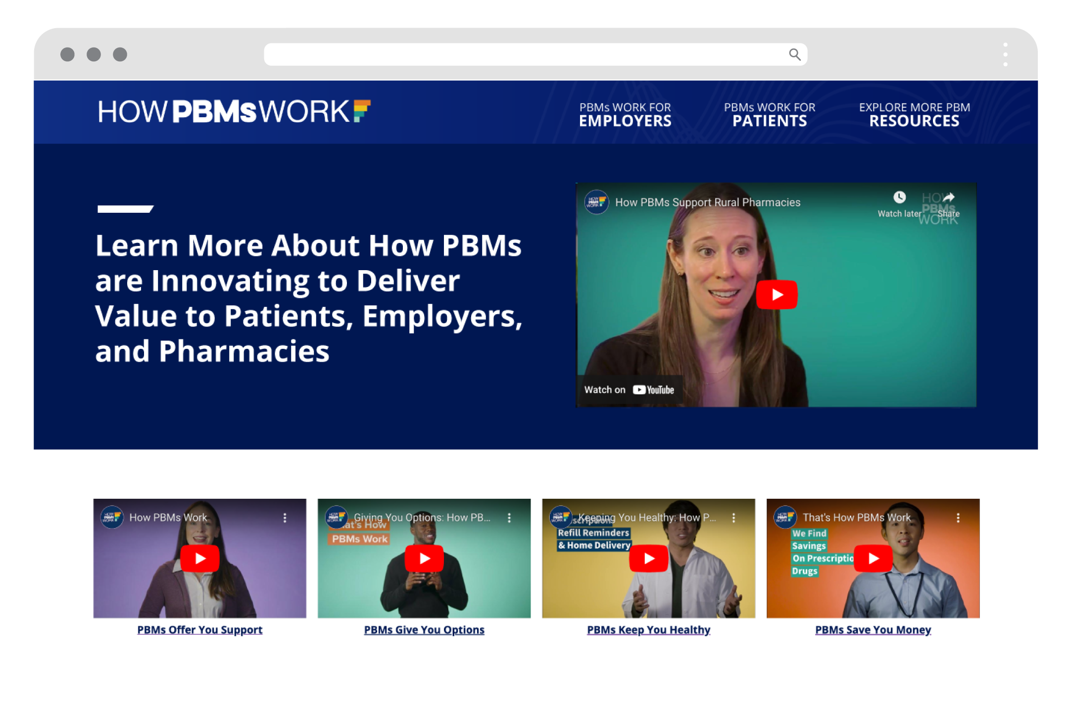
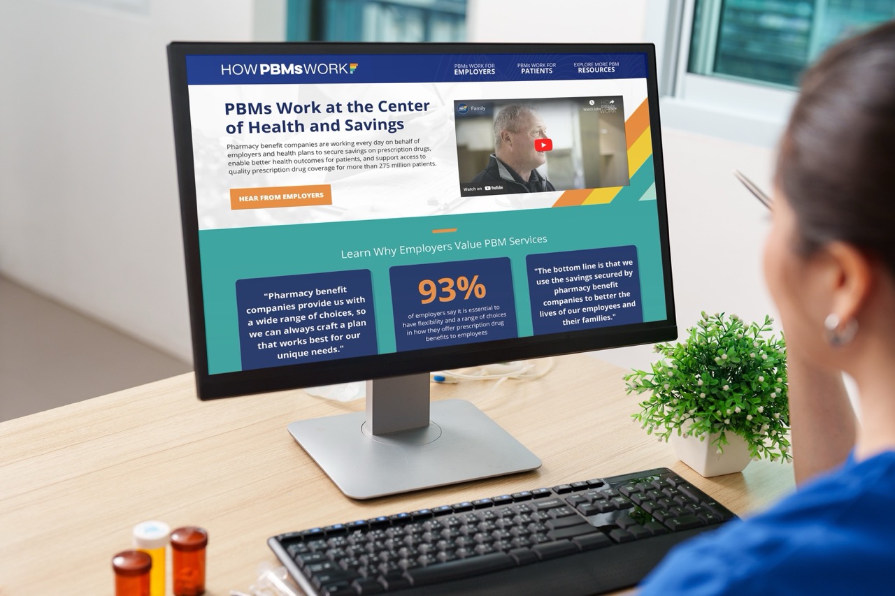
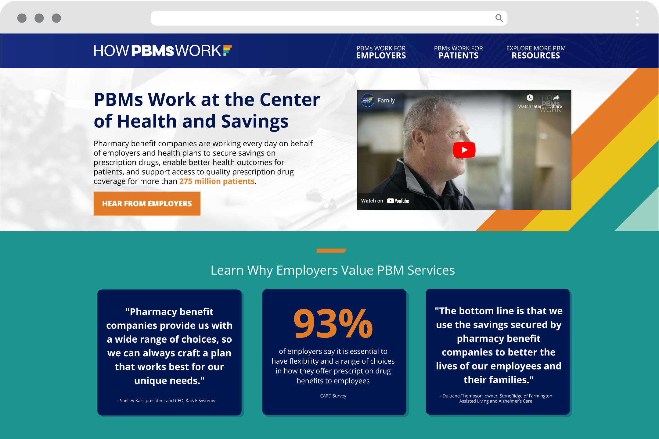
I designed the How PBMs Work brand, logo and website from the ground up. The goal was to turn a complex, often misunderstood industry into clear, approachable stories for employers and patients.
The Process
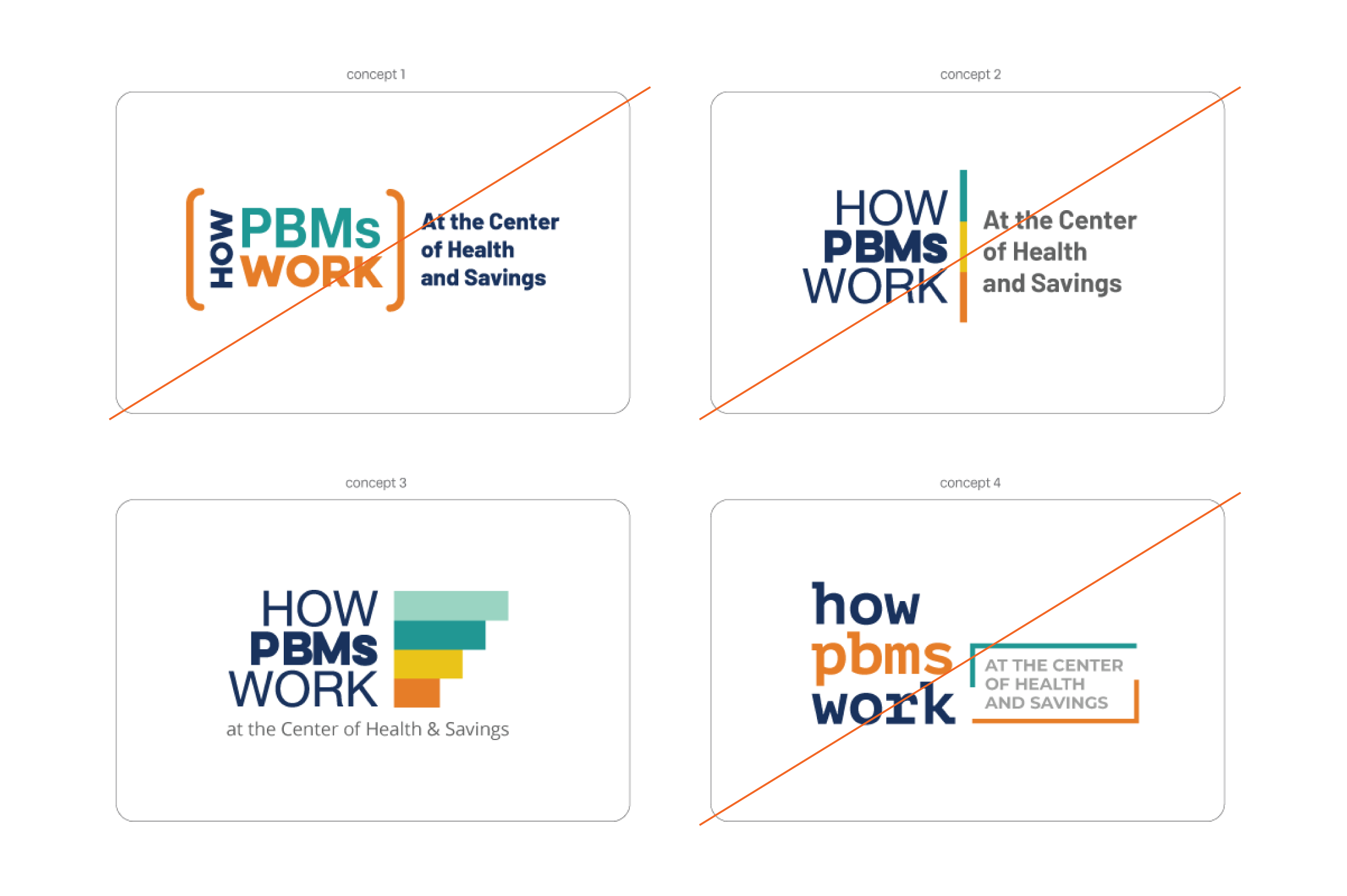
Defining the Brand
I started by learning how pharmacy benefit companies operate and who needed to understand them. Early logo explorations tested different ways to make an industry acronym feel friendly and trustworthy, not corporate.
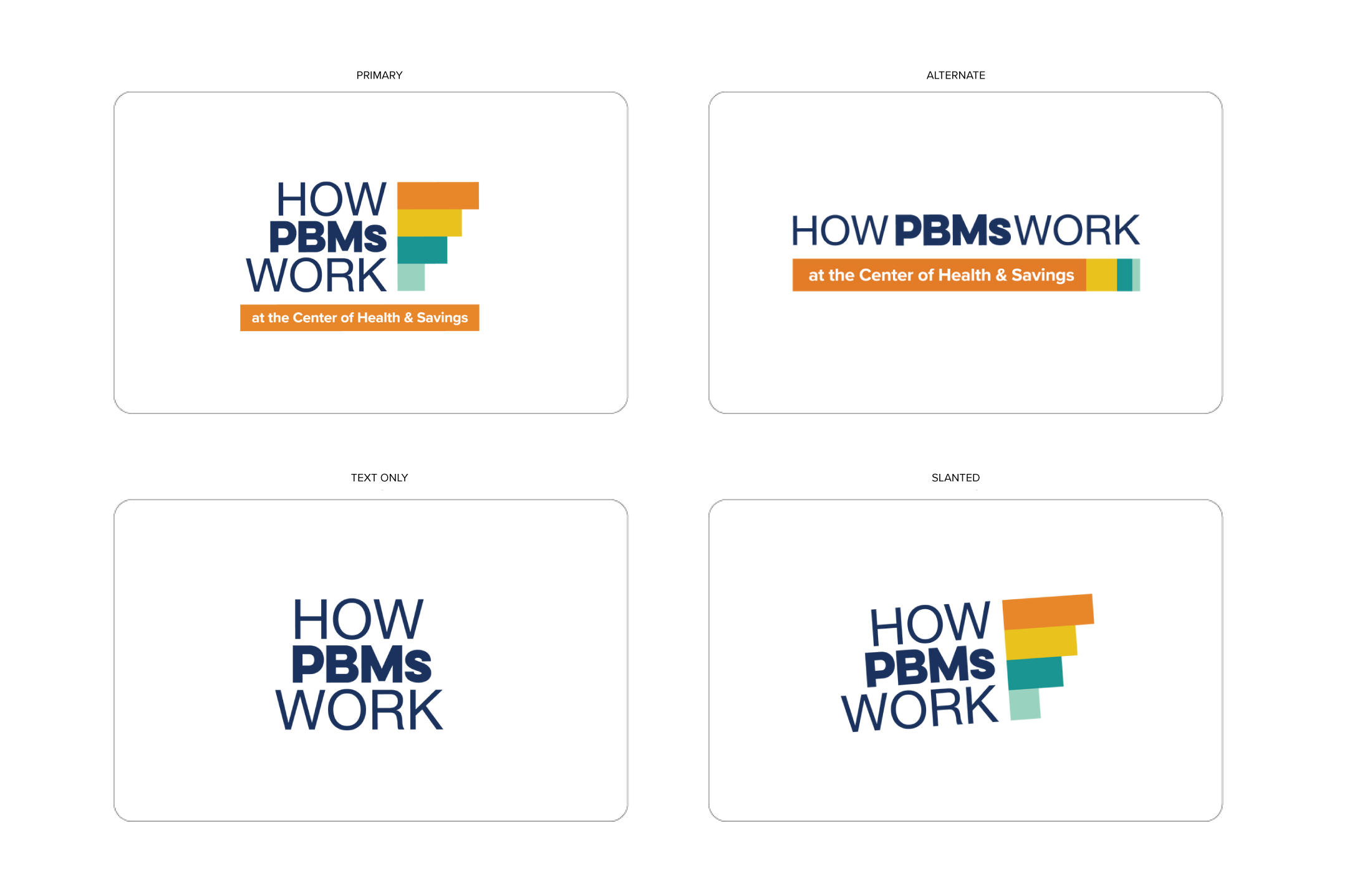
Refining the Logo
I narrowed the concepts down to a confident wordmark that puts “PBMs” front and center. A colorful mark represents the many paths PBMs create to savings, and stacked and horizontal versions keep it flexible across the site, video and print.
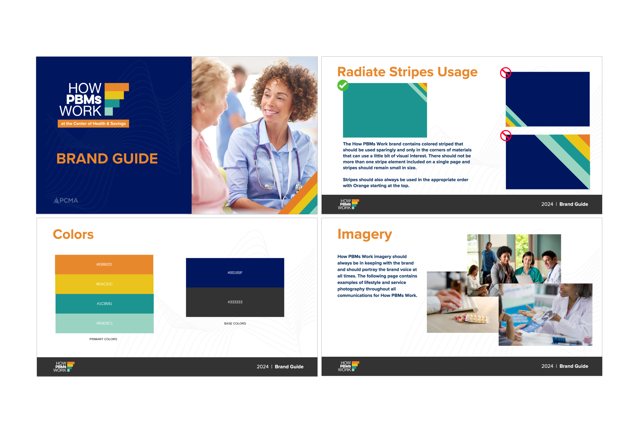
Creating Brand System
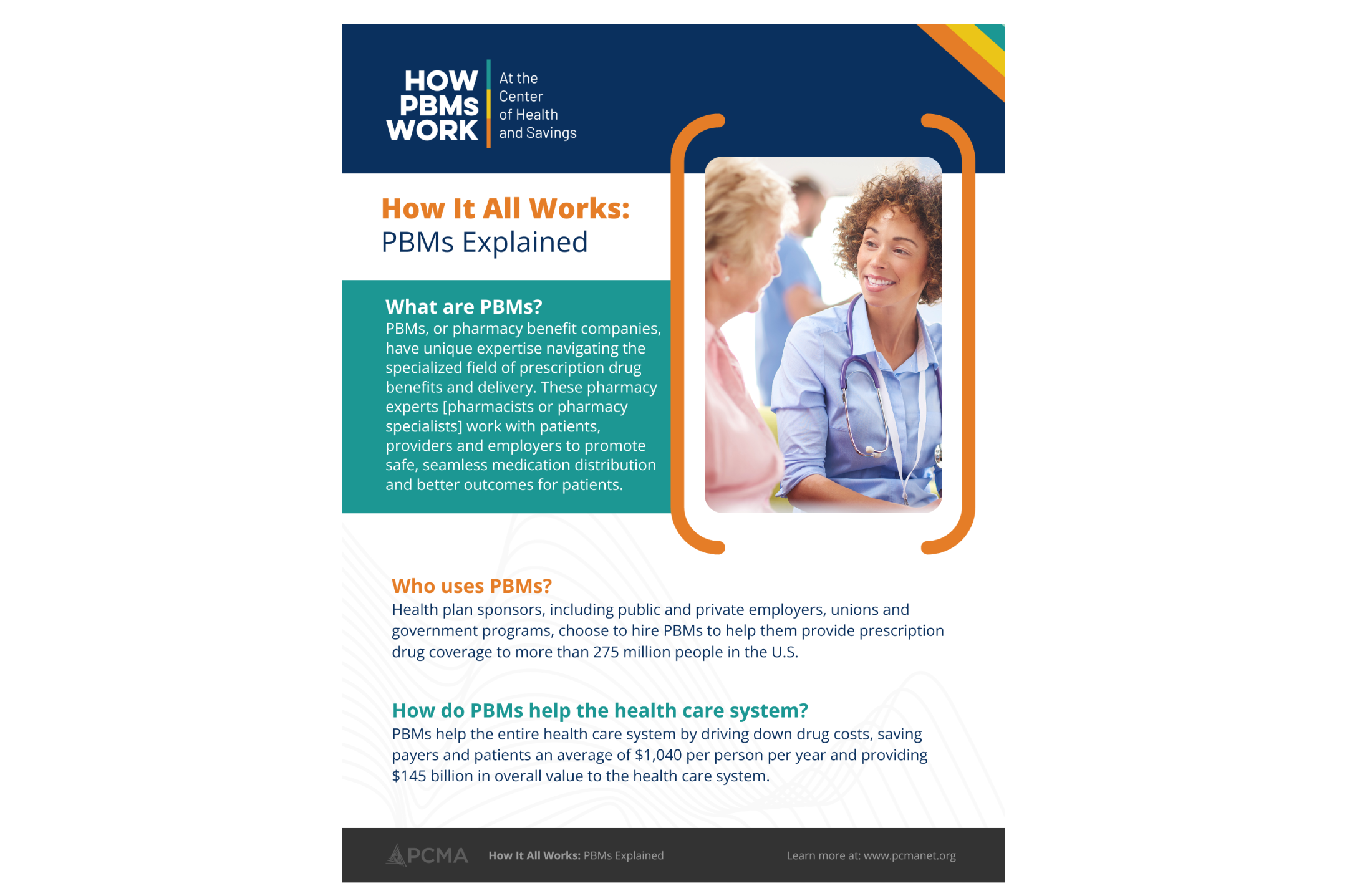
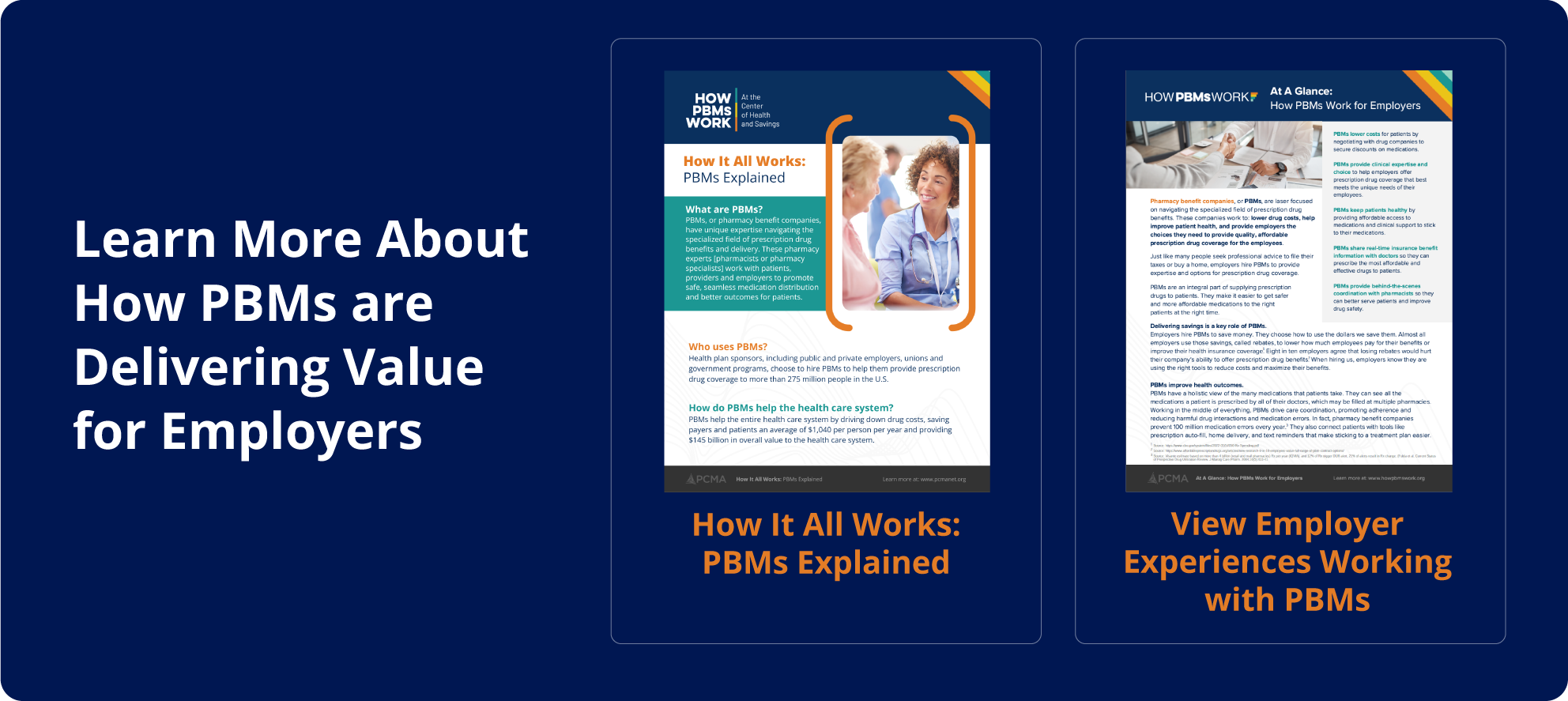
The brand guide sets out the color palette, typography, imagery style and signature ribbon stripes, so every page, video thumbnail and one-pager looks like part of the same family.